In the bustling digital marketplace, your website is more than just a digital business card; it’s your 24/7 storefront, your hardest-working salesperson, and your primary handshake with the world. But what if this critical asset is turning away more customers than it attracts? The culprit often isn’t the content or the offer, but the very foundation it’s built upon. In an era dominated by smartphones and tablets, a one-size-fits-all website is a recipe for obscurity.
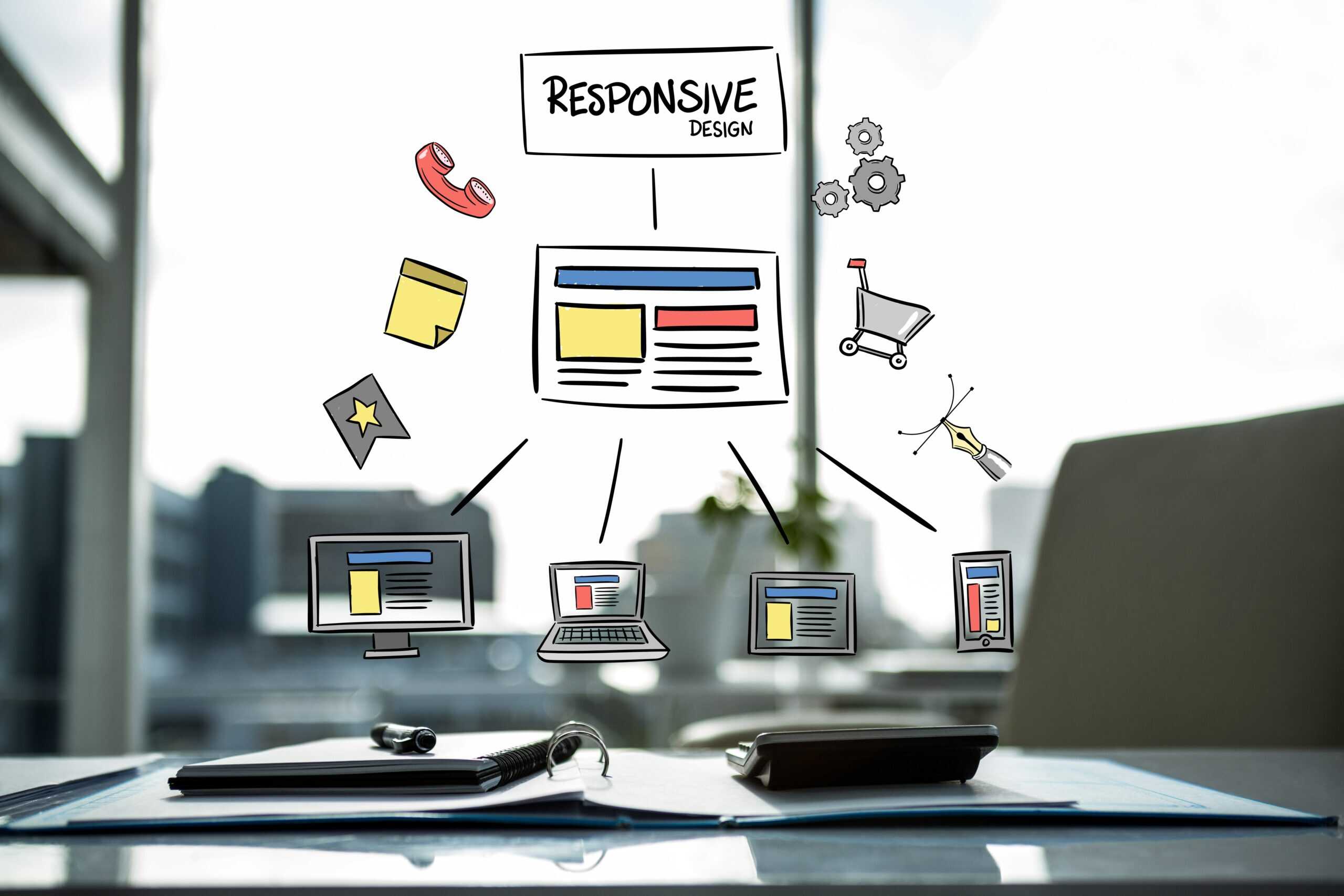
This is where Responsive Web Design (RWD) transitions from a technical buzzword to a fundamental business strategy. It’s the art and science of crafting a website that fluidly adapts to any screen size—from a widescreen desktop monitor to the smartphone in your palm. But its impact goes far beyond mere aesthetics. For businesses serious about growth, RWD is the powerful, often invisible engine that drives both search engine visibility and user conversions.
Let’s dive into the human stories and technical realities behind why partnering with a leading Web Design Company that masters RWD is one of the smartest investments you can make.
The Mobile-First World is Here: It’s Not Just a Trend, It’s the Reality
Think about your own habits. The last time you needed to find a restaurant, research a product, or look up a service, what did you reach for? Chances are, it was your phone. You’re not alone. Google has confirmed that over half of all web traffic globally comes from mobile devices. Google itself has moved to mobile-first indexing, meaning it primarily uses the mobile version of your site’s content for indexing and ranking.
If your website is a rigid, desktop-centric design that forces mobile users to pinch, zoom, and scroll horizontally, you are fundamentally at odds with how people use the web today. You’re creating friction, and in the digital world, friction is the enemy of engagement.
The SEO Superpower of Responsive Design: Speaking Google’s Language
Search Engine Optimization (SEO) is no longer just about keywords and backlinks. It’s about user experience (UX), and Google’s algorithms are sophisticated enough to measure it. A top SEO company will always prioritize technical foundations like RWD because it directly influences several key ranking factors.
- One Site, One URL: The Power of Consolidation
Before RWD, businesses often created separate mobile sites (e.g., m.example.com). This fragmented your SEO efforts. You had to build backlinks to two different URLs and manage duplicate content issues. A responsive design means you have a single URL with a single set of HTML, CSS, and content. This makes it exponentially easier for Google to crawl, index, and understand your site, consolidating your ranking signals and making your SEO campaign far more efficient and powerful. - Dwell Time and Bounce Rate: The Silent Ranking Judges
Imagine a user clicks on your site from a Google search on their phone. They’re met with a cluttered, unreadable mess. How long will they stay? A few seconds at most before hitting the “back” button. This short dwell time and high bounce rate send a clear signal to Google: “This site did not satisfy the user’s query.” Consequently, your rankings drop.
A responsive site, crafted by a skilled Web Design Company, welcomes the user with a perfectly formatted page. Text is readable, buttons are tappable, and navigation is intuitive. The user stays, explores, and engages. This positive user experience tells Google, “This is a quality result,” boosting your rankings for the long term.
- Core Web Vitals: The New SEO Currency
Google’s Core Web Vitals are a set of specific metrics that measure real-world user experience, focusing on loading, interactivity, and visual stability. A responsive design is inherently better positioned to excel in these areas:
- Largest Contentful Paint (LCP): A well-coded responsive site can serve appropriately sized images for each device, ensuring faster loading times on mobile networks.
- Cumulative Layout Shift (CLS): RWD prevents unexpected layout shifts as the page loads, which is a common problem on non-responsive sites when elements jump around on a small screen.
By building a responsive foundation, you are future-proofing your site against evolving SEO standards, a strategy any top SEO company would endorse.
Driving Conversions: The Human Connection Behind the Code
While SEO gets you seen, conversions are what drive your business. A conversion can be a sale, a sign-up, a phone call, or a contact form submission. RWD is a conversion rate optimization (CRO) machine because it respects the user’s journey, regardless of their device.
- Building Trust Through Professionalism
Your website is a direct reflection of your brand. A broken, unresponsive site on a mobile device screams “unprofessional” and “outdated.” It erodes trust instantly. Conversely, a seamless, responsive experience communicates competence, attention to detail, and a commitment to customer comfort. People buy from businesses they trust. A responsive design builds that trust from the first click. - Reducing Friction at Every Touchpoint
Frustration is the death of a sale. A non-responsive website is full of friction:
- A “Request a Quote” button that’s too small to tap accurately.
- A contact form with fields that are impossible to fill out.
- Text so small it requires constant zooming.
A responsive design eliminates these pain points. Buttons are thumb-friendly, forms are simplified for mobile, and content flows naturally. By making the path to conversion effortless, you guide users smoothly toward your goal, dramatically increasing your conversion rates.
- Consistency Breeds Confidence
When a user switches from their laptop to their phone to continue browsing your products, a responsive design ensures a consistent experience. The branding, navigation, and content are familiar. This consistency reinforces your brand identity and makes the user feel secure, encouraging them to complete their purchase or inquiry no matter where they are.
Why You Need a Strategic Partner, Not Just a Coder
Building a truly effective responsive website isn’t just about using flexible grids in CSS. It requires a strategic blend of technical expertise, design psychology, and SEO foresight. This is the difference between a freelance coder and a professional Best Website Development Company.
A top-tier agency will:
- Design with Intent: They don’t just make things fit; they prioritize content and calls-to-action (CTAs) for different screen sizes, ensuring the most important messages are always front and center.
- Prioritize Performance: They understand that a responsive site must also be a fast site, optimizing code, images, and server response times across all devices.
- Integrate SEO from the Ground Up: SEO is not an afterthought. It’s woven into the information architecture, the clean code, and the user-friendly design from day one.
Cserve Technologies | India: Your Partner in Digital Excellence
In a landscape filled with developers, finding a partner who understands the intricate connection between design, development, SEO, and business growth is paramount. This is where Cserve Technologies | India stands out.
As a premier Web Design Company and a recognized Best Website Development Company in India, Cserve Technologies embodies the holistic approach necessary for modern digital success. They don’t just build websites; they craft dynamic, responsive digital experiences that are engineered to perform.
Their team of experts understands that a beautiful design is meaningless if it doesn’t rank on Google or convert visitors. By integrating robust SEO principles directly into their development process, they function as a top SEO company would, ensuring that every site they deliver is not only visually stunning and user-friendly but also a powerful tool for organic growth. If you’re looking for a partner to build a future-proof, high-converting online presence, Cserve Technologies offers the technical prowess and strategic vision to get you there.
Conclusion: It’s Time to Adapt and Thrive
The question is no longer if you need a responsive website, but how well your current site adapts to the multi-screen lives of your customers. Responsive Web Design is the cornerstone of modern digital strategy. It is the critical link that ensures your visibility in a mobile-first search world and creates the seamless, trustworthy experience that turns casual visitors into loyal customers.
Investing in a responsive redesign is not merely a technical upgrade; it’s a direct investment in your brand’s credibility, your search engine rankings, and your bottom line. By partnering with a skilled agency that understands this synergy—like a Cserve Technologies—you are not just building a website; you are building a dynamic, growth-oriented asset for the future. Don’t let a rigid design be the bottleneck for your success. Embrace responsiveness, and watch your digital presence transform.
Frequently Asked Questions (FAQs)
- Isn’t a separate mobile website just as good as a responsive one?
While separate mobile sites (m.dot sites) were a solution in the past, they are now largely outdated. They create SEO challenges with duplicate content, require double the maintenance, and often provide an inconsistent user experience. A single, responsive site is Google’s recommended configuration and is far more efficient to manage and optimize. - My desktop site gets most of my traffic. Do I still need RWD?
Traffic analytics can be deceptive. If your site isn’t mobile-friendly, you are likely turning away a significant portion of your potential audience. Furthermore, with mobile-first indexing, a poor mobile experience will eventually harm your desktop rankings as well. RWD is essential regardless of your current traffic split. - Is Responsive Web Design more expensive?
Initially, a responsive design may require a higher investment than a basic desktop site. However, it is far more cost-effective in the long run. You maintain only one website, your SEO efforts are consolidated, and you avoid the cost of rebuilding a separate mobile site later. The ROI from improved rankings and higher conversions makes it a wise financial decision. - How does RWD affect my website’s loading speed?
A poorly implemented responsive design can be slow. However, a professional Best Website Development Company will use techniques like conditional loading (where certain elements are only loaded if needed for a specific device) and image optimization to ensure the site is fast on all connections, including mobile data. - Can I just use a free template to make my site responsive?
While free templates can be a starting point, they are often bloated with generic code, lack customization, and may not be optimized for SEO or conversions. A custom-built responsive design from a professional agency is tailored to your specific business goals, ensuring optimal performance, security, and a unique brand identity.