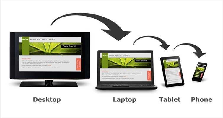
In the dynamic world of web development, staying ahead of the curve is essential to delivering exceptional user experiences. As technology continues to evolve, responsive design remains a cornerstone of modern web development, ensuring that websites adapt seamlessly to various devices and screen sizes. In the realm of WordPress development, Cserve Technologies, the No. 1 Website Design and Development Agency, incorporating the latest trends in responsive design can elevate your website to new heights of functionality and aesthetics. Let’s check out some of the trending features in responsive design for WordPress development and explore how they can enhance your website from the user’s point of view.
Mobile-First Design Approach:
With the majority of internet traffic coming from mobile devices, adopting a mobile-first design approach is paramount. By prioritizing the mobile user experience during the design phase, Our Top WordPress developers can create websites that are optimized for smaller screens and touch interactions. This approach involves designing for mobile devices first and then scaling up to larger screens, ensuring a seamless experience across all devices.
Flexible Grid Layouts:
Flexible grid layouts play a crucial role in responsive design, allowing content to adapt dynamically to different screen sizes. In WordPress development, utilizing flexible grid systems such as CSS Grid or Flexbox enables developers to create fluid and responsive layouts that adjust proportionally to the user’s device. This flexibility ensures that content remains visually appealing and easily accessible across a wide range of screen resolutions.
Scalable Vector Graphics (SVGs):
As high-resolution displays become increasingly prevalent, incorporating scalable vector graphics (SVGs) into WordPress websites has become a popular trend. Unlike raster images, SVGs are resolution-independent and can be scaled infinitely without losing quality. By utilizing SVGs for icons, logos, and other graphical elements, WordPress developers can ensure crisp and clear visuals across all devices, from smartphones to high-definition monitors.
Progressive Web App (PWA) Integration:
Progressive Web Apps (PWAs) combine the best features of web and mobile apps, delivering fast, reliable, and engaging experiences to users. Integrating PWA functionality into WordPress websites allows users to access content offline, receive push notifications, and enjoy app-like interactions directly through their web browser. By embracing PWA technology, WordPress developers can create immersive experiences that rival native mobile apps while maintaining the flexibility and accessibility of the web.
Performance Optimization:
In the age of instant gratification, website performance is paramount to user satisfaction and retention. We have the Expert WordPress developers, who are continuously focusing on performance optimization techniques such as lazy loading, minification, and caching to ensure fast page load times and smooth browsing experiences across all devices. By prioritizing performance during development, Our WordPress websites can deliver snappy and responsive interactions that keep users engaged and coming back for more.
Incorporating these trending features in responsive design can take your WordPress development projects to the next level, ensuring that your websites are not only visually stunning but also highly functional and user-friendly across all devices. Whether you’re building a personal blog, an e-commerce platform, or a corporate website, embracing the latest trends in responsive design can help you stay ahead of the competition and deliver exceptional experiences to your audience.


